MOBILE APP · HEALTHFIRST · SHIPPED 2023
Easing Access and Usability to the OTC Health Insurance Benefit
OVERVIEW
What if members could access their most-used insurance benefit inside the app they already trust?
Healthfirst's Over-the-Counter (OTC) benefit gives members a preloaded card to buy approved health items at participating stores. But the experience lived on a glitchy, third-party site with no Healthfirst branding — and members couldn't even check their balance inside Healthfirst's own apps. As the mobile designer on a Kin and Carta team, I led the UX for bringing this benefit fully into the Healthfirst mobile app.
Solution
A one-stop OTC experience, designed for the moments it's actually used:
View balanace, eligible products, retailers, and reimbursement
All in one place. The three categories members reached for most are surfaced directly on the home screen.
Scan a product in-store to check OTC eligibility instantly
A mobile-only feature built for the exact in-aisle moment members described. Point your camera at a product and know immediately.
Submit a reimbursement digitally
Replaces a phone-and-paper process with a guided in-app flow. No calls, no paperwork.

CHALLENGE
Building trust where members had stopped expecting it.
The OTC benefit was already one of Healthfirst's most-used benefits, but every interaction happened on a third-party site that members described as glitchy, off-brand, and confusing. Stakeholder interviews surfaced an additional layer: this benefit was strategic for Healthfirst, because growing digital engagement directly impacts the STAR rating that determines federal Medicare funding.
The Stakes
There was a layer beyond the member experience problem. For Healthfirst, digital engagement in Medicare Advantage plans directly impacts the CMS STAR rating, a federal score that determines plan funding levels and renewal eligibility. Growing members' in-app engagement with high-value benefits like OTC wasn't just good product thinking. It was a business mandate with a measurable outcome. That mandate shaped every prioritization decision in this project: member value had to pair with engagement impact to make the MVP cut.
HMW
How might we bring the OTC benefit into Healthfirst's app in a way that's intuitive, trustworthy, and useful in the exact moments members reach for it?
DISCOVERY
I had to learn the current OTC experience before I could redesign it.
scope.
Before any interviews, I walked through the existing third-party experience myself, activating a card, navigating the catalog, attempting a reimbursement. That hands-on time made the pain points visceral rather than abstract before I sat down with members. Then I brought that context into 8 member interviews to find out where the experience was breaking down for people who depended on it.
Members previously accessed OTC through a glitchy third-party desktop only site with no Healthfirst branding.
What we heard in 8 interviews
Three patterns emerged across every session, each one pointing directly to a design decision.
01
The third-party experience broke trust
The site members used didn't carry Healthfirst's branding and was prone to glitches. Members assumed problems were Healthfirst's fault even when they happened off-platform.
02
Members didn't know what OTC actually covered
Most thought OTC was limited to personal health and hygiene. One only discovered the card also covered produce after calling support for an unrelated issue.
03
In-store, the card was a source of embarrassment
Members regularly used the card at independent pharmacies where clerks weren't familiar with it, and items routinely got rejected at checkout in front of other shoppers.
KEY INSIGHT
Members didn't need more education instead they needed answers in the exact moment they had questions.
STRATEGY
Before any design work we got the team aligned on what we were actually building.
After discovery, we had more validated member needs than we could ship in one release. That's a common place to get stuck: everyone has an opinion, priorities feel urgent, and without a shared framework the loudest voice in the room wins. Before anyone opened a design file, I proposed we run a RICE scoring session together with PM and engineering at the table.
RICE (Reach, Impact, Confidence, Effort) gave us a common language. More importantly, it forced effort estimates to come from engineering directly rather than from my assumptions. Effort is the variable designers most often get wrong when scoping alone. By scoring together, the output wasn't just a priority list. It was a decision the whole team owned.

RICE prioritization scoring across 7 candidate features, sorted highest to lowest. PM + Design + Engineering session. · September 2023 · Miro
What made the Cut
Five features made the cut: view OTC balance (270), find participating retailers (68), find eligible products (40), barcode product scan (31), and digital reimbursement (22). Two were deferred. Balance expiry alerts had the highest reach of any feature we evaluated (90% of members) but required push notification infrastructure that didn't exist yet. Once engineering confirmed that, the effort jumped from 3 sprints to 10 and the score fell below the threshold. I documented it as the top v2 priority. Home delivery ordering was blocked by the third-party API contract entirely. Both deferrals had a paper trail.
Competitive Analysis
Before moving to high-fidelity, I audited mobile patterns across healthcare, insurance, and retail. Members compare Healthfirst to every app they use daily, not just other health plans. Two patterns carried directly into the design: surfacing high-frequency actions on the home screen, and using explicit empty states to explain gaps rather than leaving members to troubleshoot.
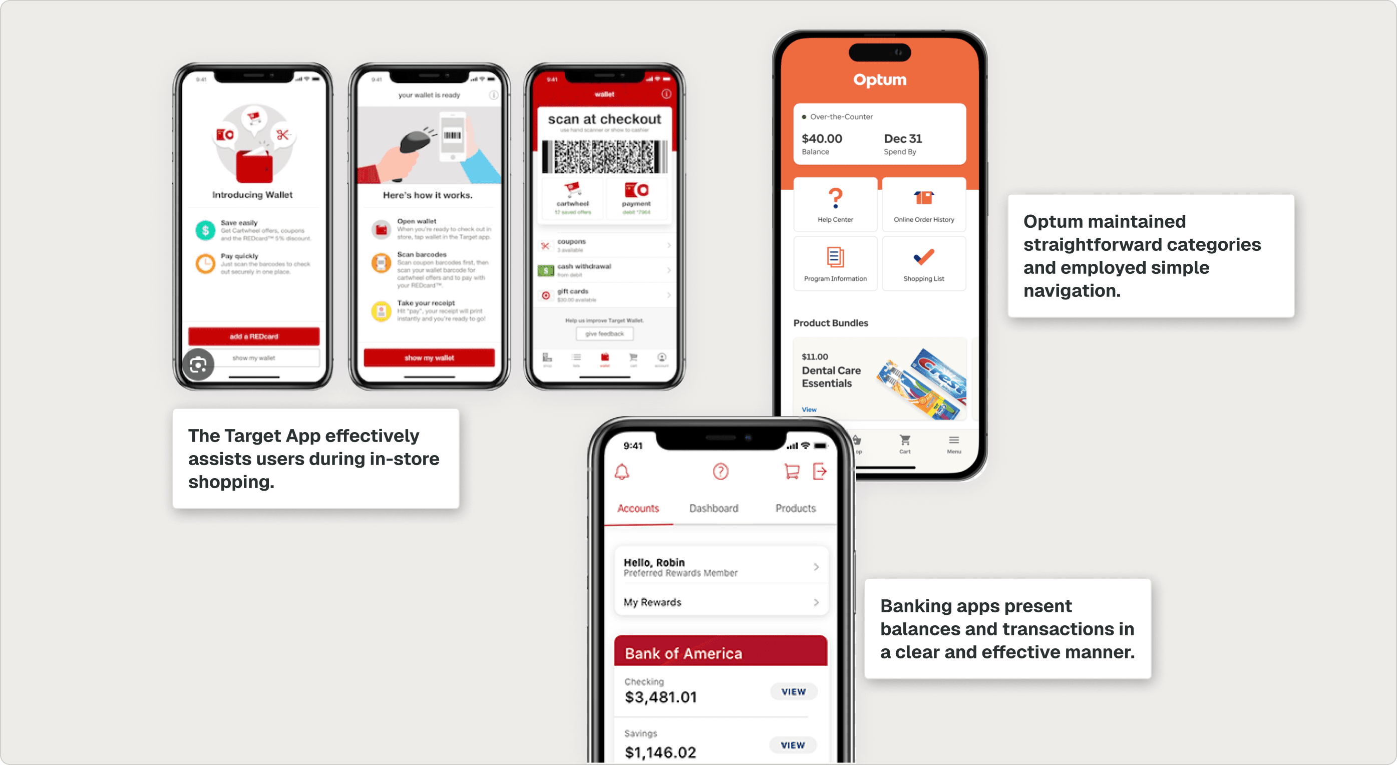
Pattern audit of comparable mobile apps.
DESSIGN AND ITERATION
When strategy meets the reality of what we are building.
Working with a Constrained API
The OTC network API was the single biggest design constraint. It was inconsistent, had unusual rules (e.g., users had to select a retailer before they could search for a product), and major changes weren't feasible inside our timeline.
Rather than fight the API, I treated developers as design partners from day one:
Constant communication with engineering and PM to surface limitations early
Continuous feasibility checks - prototypes shared in-progress, not at handoff
Creative UX workarounds when the API couldn't change
The "retailer-before-product" constraint became a clearer, more guided search flow — a searchable retailer dropdown, a meaningful empty state, and a helpful error if users tried to skip the step.
"When the API is the constraint, the designers who ship are the ones in constant conversation with developers, not the ones who hand off final mocks and hope."
Project Reflection
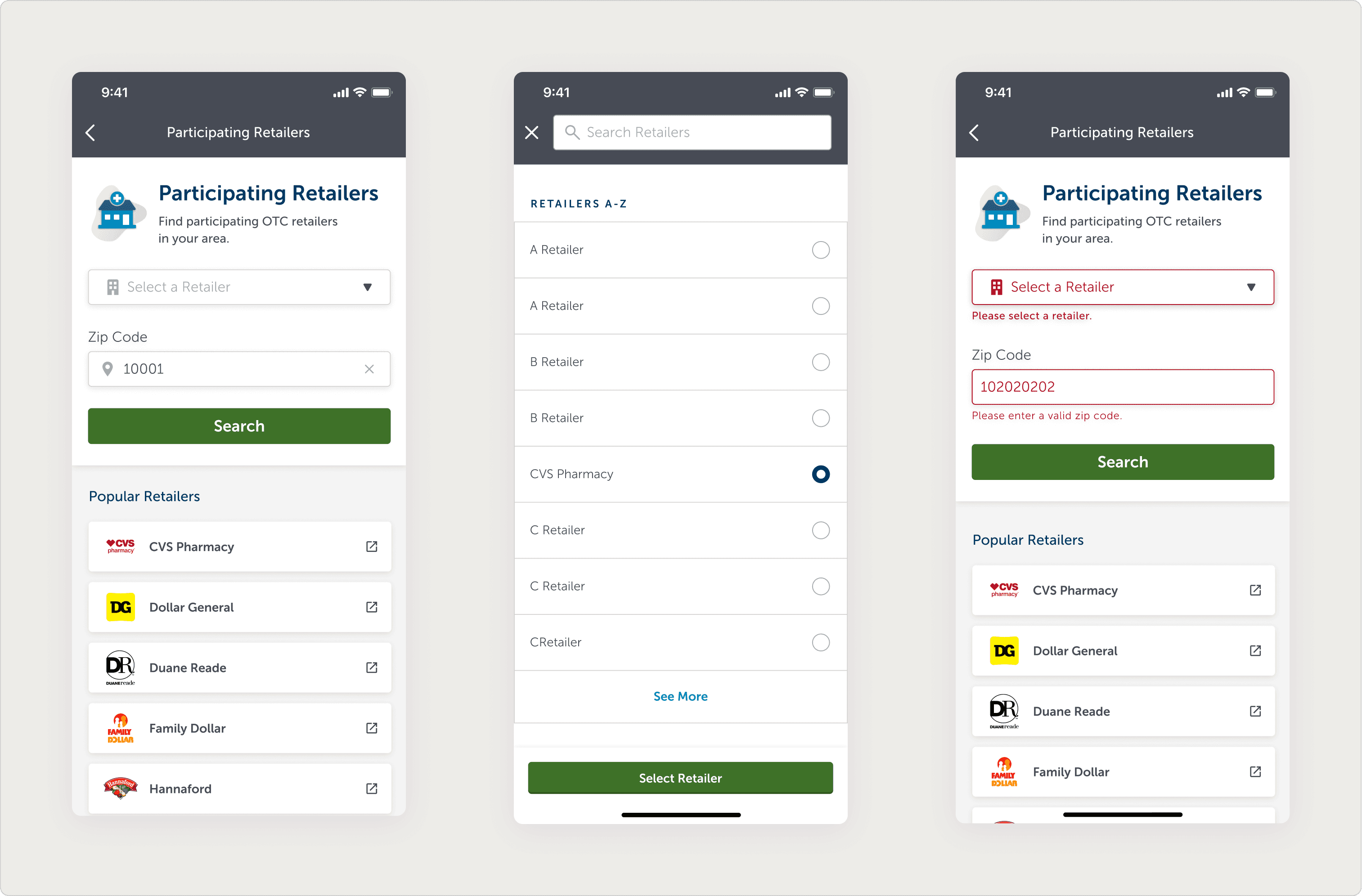
A backend constraint, turned into a more guided product-search flow.
Usability Testing
Two rounds of usability testing served two different purposes. The first validated the strategy: the features we had scored highest were the ones members reached for without prompting. The second surfaced a structural fix: members stalled on the home screen because the entry points weren't weighted clearly enough. That finding drove the final architecture, surfacing Balance, Products, and Retailers directly on load.

Testing insights and the iterations they drove.
FINAL DESIGN
A mobile feature members can actually use in the aisle.
Mimicking Real Life
The most deliberate design decision in the project wasn't a flow or a layout. It was the card. The OTC benefit is used by Medicare Advantage members navigating the app in low-attention moments: in line at a pharmacy, waiting for an appointment, helping a family member. Every member we interviewed knew exactly what their physical OTC card looked like. By mirroring it in the app, we gave members a visual anchor they didn't have to learn. They recognized the object and immediately knew they were in the right place, without reading a label or navigating a menu. Recognition is faster than reading. When a digital surface can inherit the mental model a user already has, that's not a design shortcut. It's the whole job.
KEY DESIGN DECISIONS
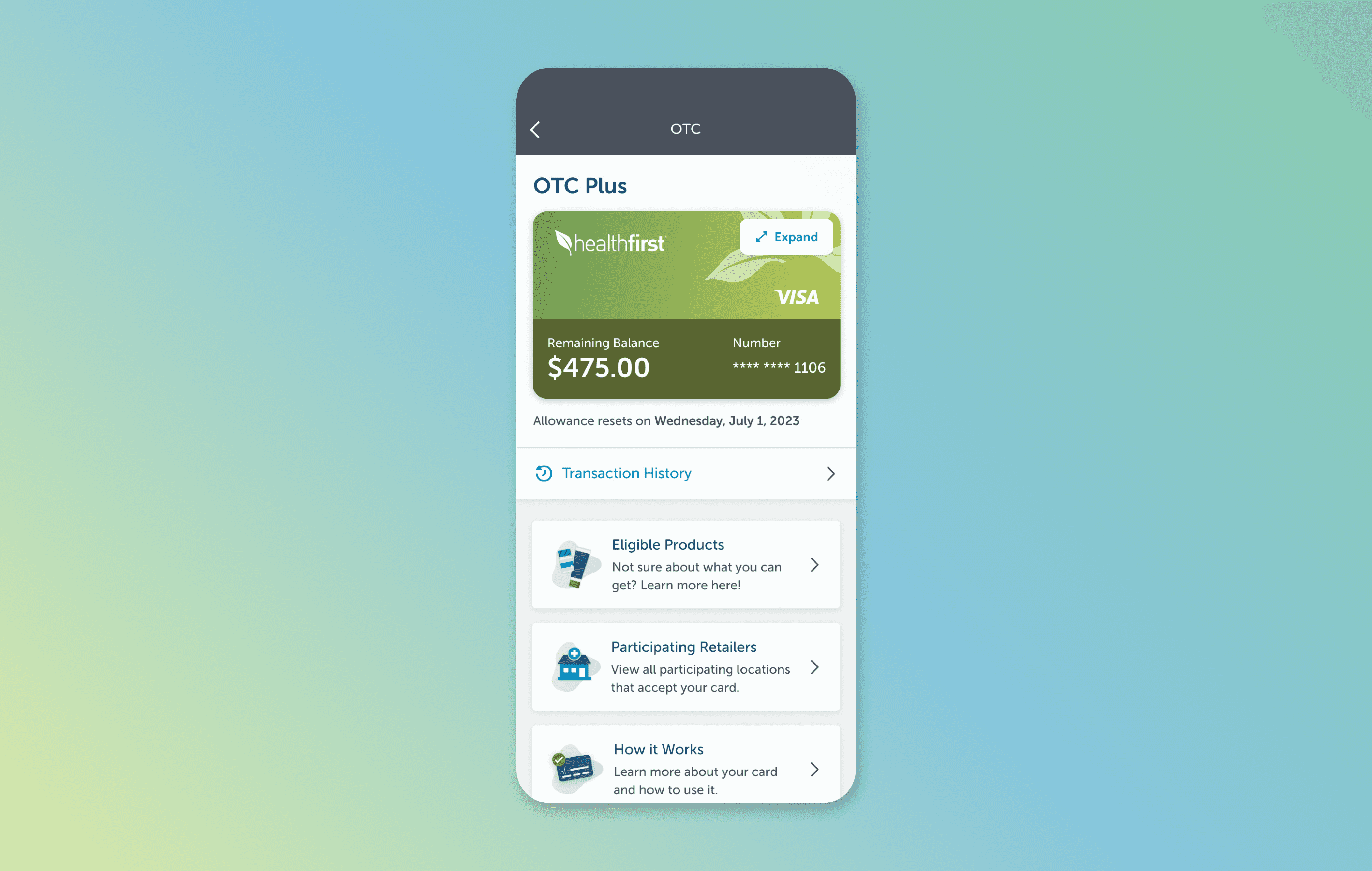
Simple, in-context navigation Three categories, Balance, Products, Retailers all anchor the home screen.
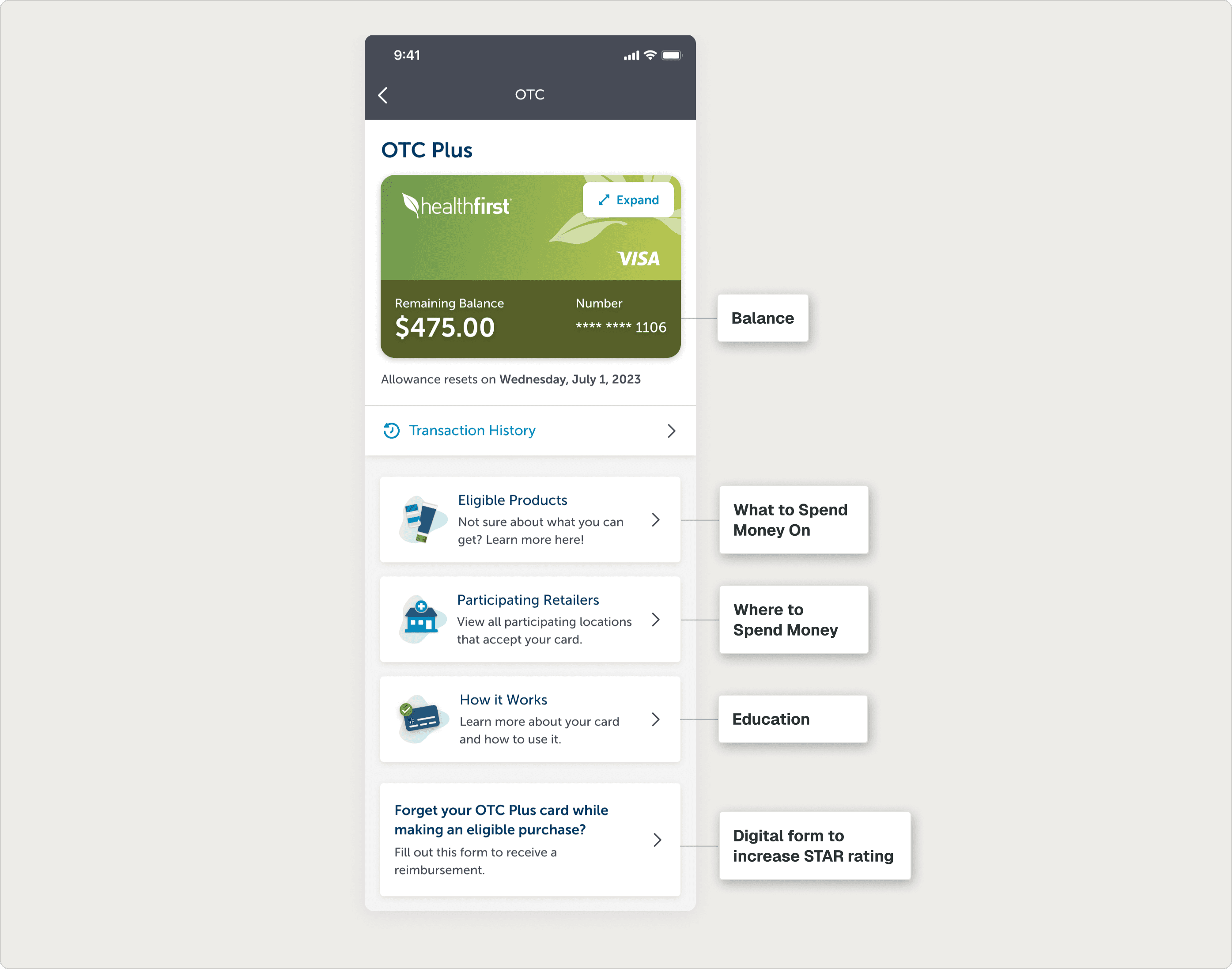
Final iteration of the in-app OTC card homepage.
In the final design, members can do all of this inside the Healthfirst app: view their OTC balance, browse and search eligible products, find participating retailers, scan items in-store, submit a digital reimbursement form, and learn how the benefit works.
Final feature flow inside the Healthfirst mobile app.
Mobile - Only: Product Scan
The single most mobile-native decision in this project came from one repeated story: members felt embarrassed at checkout when items were rejected. That insight only emerges if you're listening for emotion, not just task flow.
In collaboration with developers, we added a barcode scan: members point their camera at a product in-store and immediately know if it's OTC-eligible. The friction removed was both practical and emotional.

Product scan turns an in-aisle moment of uncertainty into a quick check.
IMPACT
Measurable results for a benefit members actually use.
The first release drove a measurable lift in digital OTC card activations and contributed to an increase in Healthfirst mobile app downloads. Both are meaningful signals for a company whose STAR rating depends on digital engagement.
Just as importantly, the OTC benefit now lives where members already expect to find it: inside Healthfirst's own app, with Healthfirst's branding and reliability. The third-party experience is no longer a barrier between members and a benefit they actively use.
Lift in digital OTC card activations
Growth in Healthfirst app downloads
STAR
Positive impact on Medicare engagement rating
REFLECTION
What I learned.
01
Treat engineering as a design partner, not a downstream filter.
When the API is the constraint, the designers who ship are the ones in constant conversation with developers — not the ones who hand off final mocks and hope. The API limitations on this project became creative prompts because we sat with them together.
02
Real-life mimicry is a cognitive shortcut.
Mirroring the physical OTC card in the digital experience saved members a step they didn't know they were taking. Recognition is faster than reading. When a digital object can visually translate a physical one, take the shortcut.
03
Mobile-specific moments deserve mobile-specific design.
The product scan only existed because we listened for the physical, emotional moments members described — uncertainty in the aisle, embarrassment at checkout. Mobile context-of-use isn't a constraint to design around; it's a feature waiting to be designed for.