WEB DESIGN · DENVER INTERNATIONAL AIRPORT · SHIPPED 2021
Redesigning the website for the 5th-Busiest Airport in the US
OVERVIEW
A world-class airport with a website that didn't show it.
Denver International Airport (DEN) is the fifth-busiest airport in the United States, moving 69 million passengers a year and generating an estimated $33.5 billion for the region annually. But flydenver.com hadn't kept pace, the site had grown page by page, with no shared visual language and no consistent structure. As the UX designer on this project, I helped lead the redesign of flydenver.com from research through to a documented, templatized handoff.
Solution
A refreshed visual system grounded in DEN's existing brand, organized by an information architecture built around the site's most-used content, and structured into reusable page templates so DEN's team could keep growing the site without redesigning it from scratch.

The site before redesign: dense link lists, minimal imagery, and an inconsistent layout across pages.

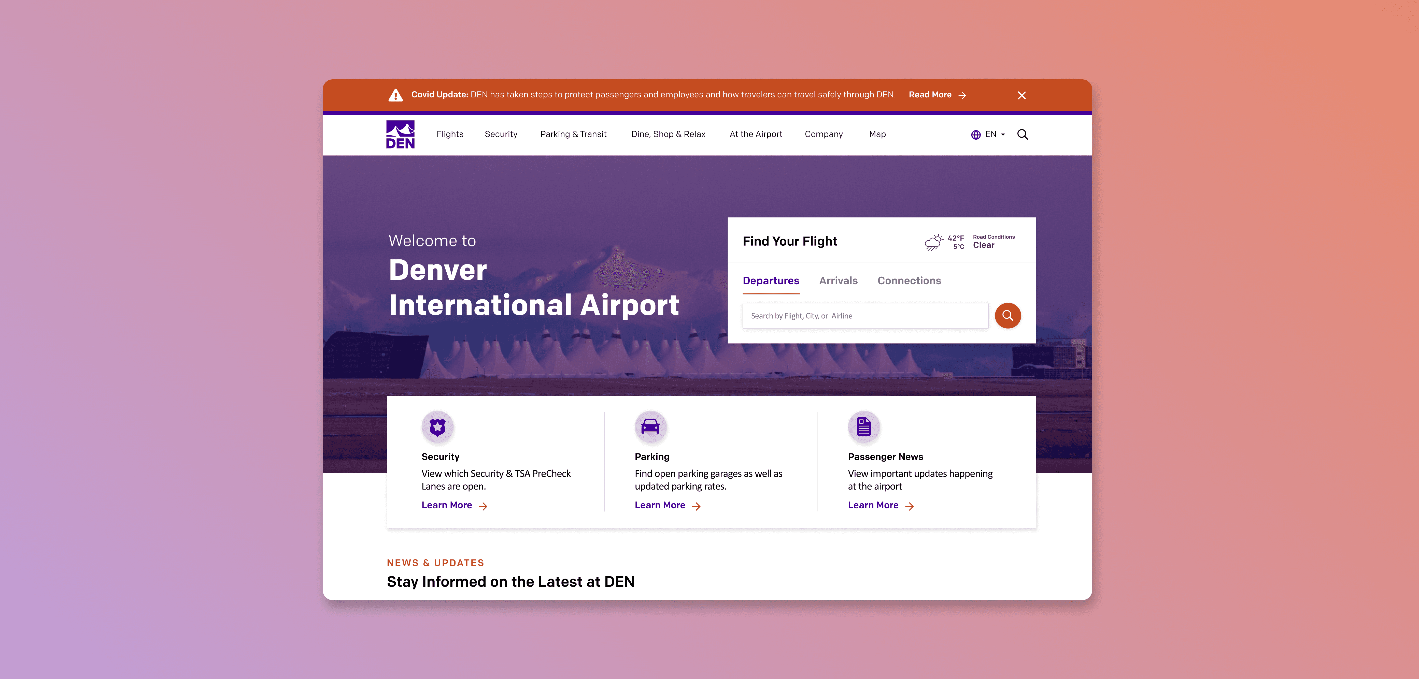
After: the redesigned homepage, built on the new design system and IA.
CHALLENGE
The site scored "Moderate" on every heuristic.
scope.
We started with a heuristic usability audit of the existing flydenver.com. The site landed in the "moderate" range on standard usability benchmarks: travelers could complete core tasks, but the experience around those tasks was inconsistent, dated, and difficult to maintain. Of all the airport sites we benchmarked, flydenver.com also had the highest share of mobile traffic, making mobile-first design a priority from day one, not an afterthought.


The initial usability audit identified three priority areas: information architecture, visual system, and template consistency.
HMW
How might we rebuild flydenver.com with a visual system and structure that could grow with the airport, without requiring a new layout every time?
VISUAL DIRECTION
Three moodboards. One clear direction.
scope.
Before moving to hi-fi design, we developed three distinct visual directions independently, without a prescribed brief, to present to the DEN stakeholder team. Developing all three from scratch forced us to genuinely inhabit each direction rather than hedge between them, which made the stakeholder presentation more decisive. Each moodboard came with a written rationale and a distinct design personality, giving the team something concrete to choose from rather than a vague direction to negotiate around.

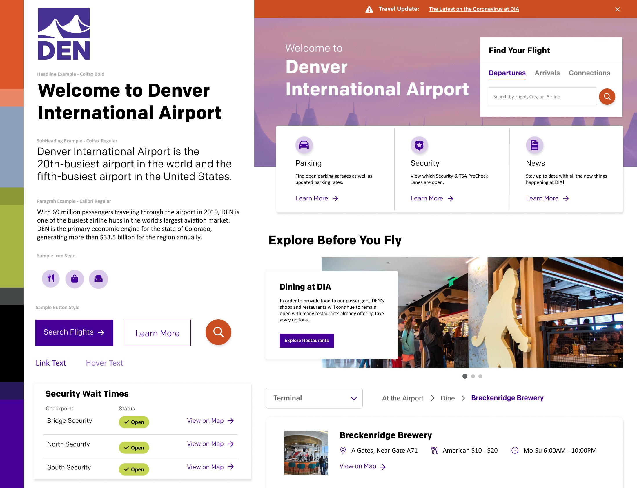

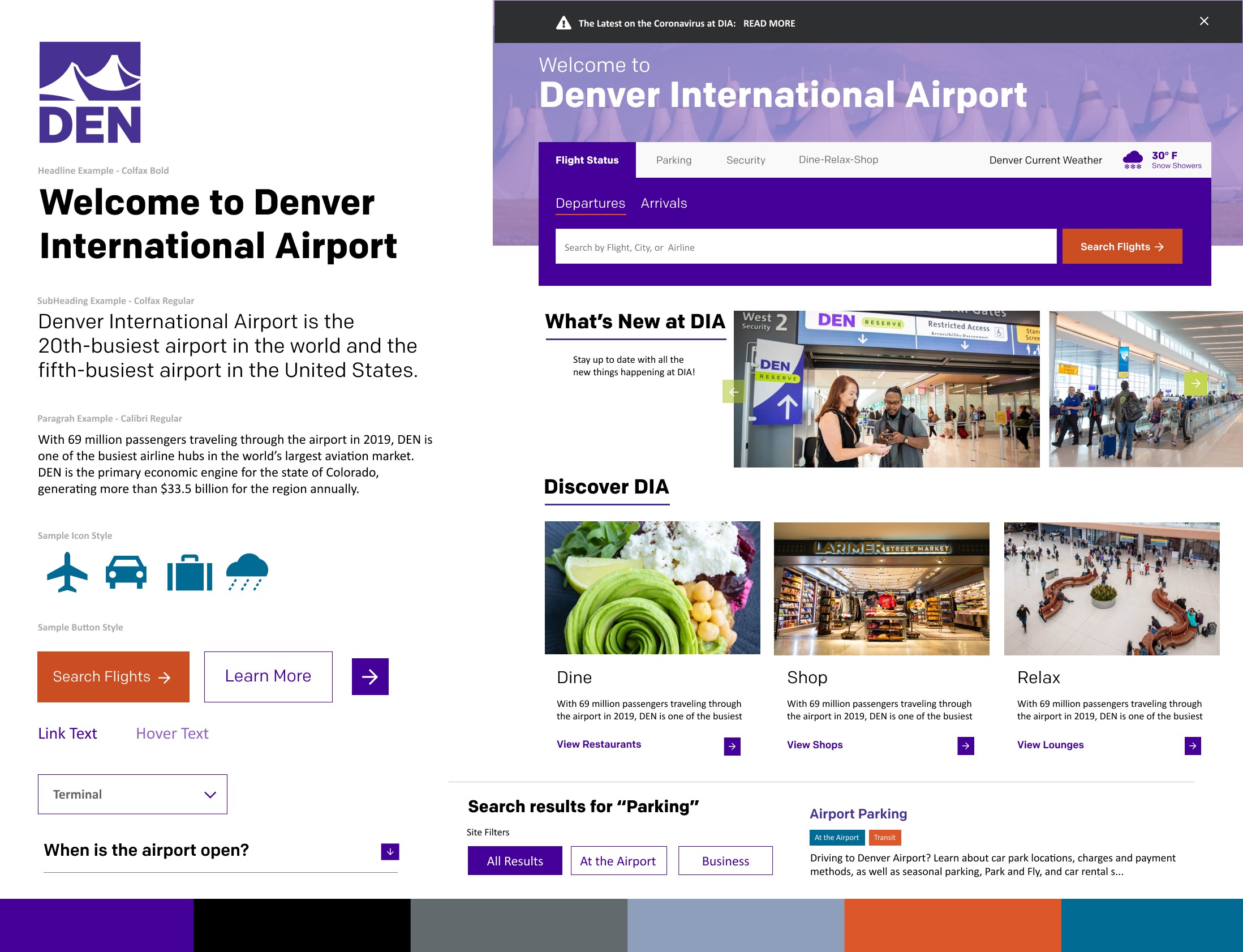
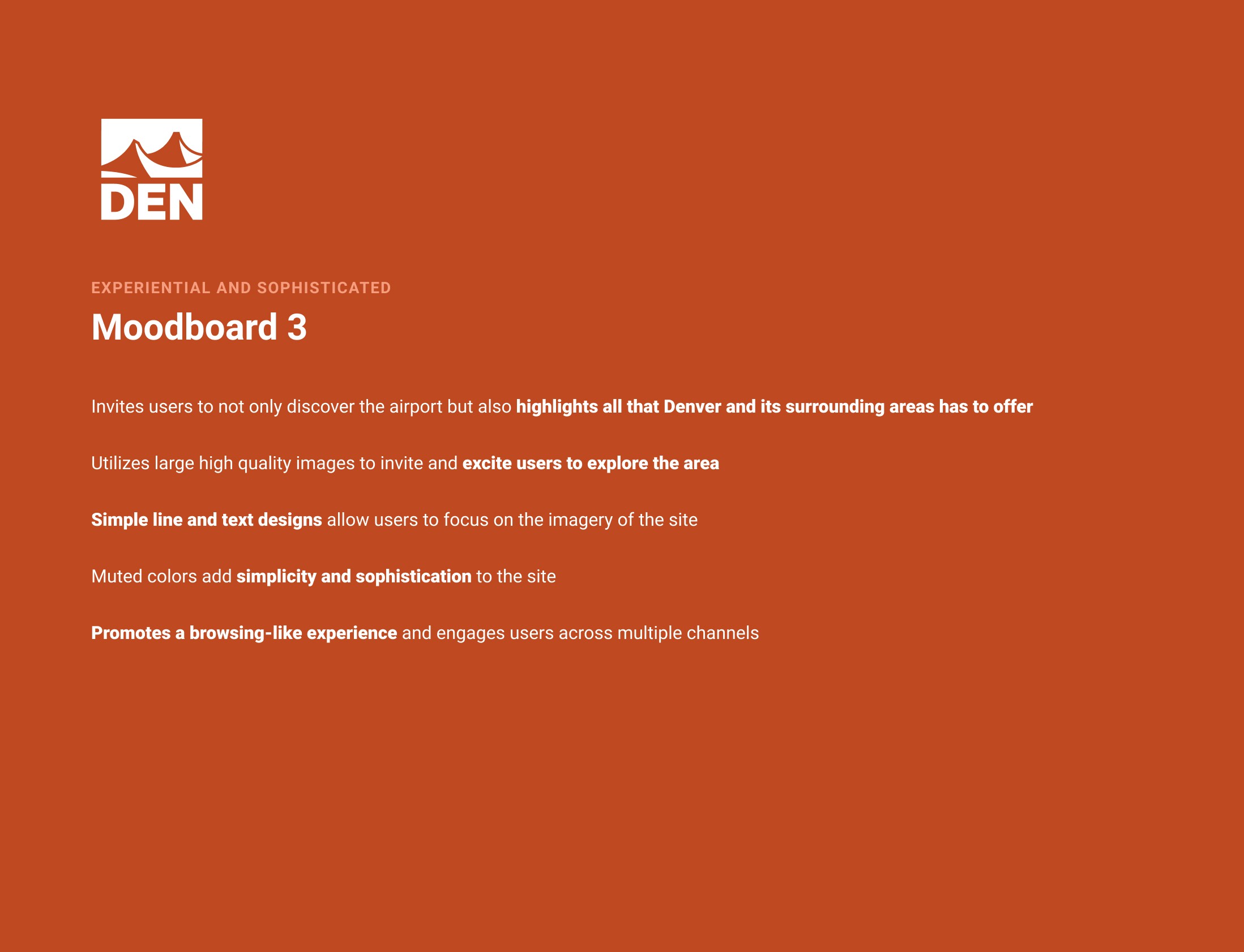

Moodboards presented to stakeholders
Why Moodboard 1 was chosen
The stakeholder team selected Moodboard 1 for its clarity and restraint. Generous white space gave the page a calmer, more considered feel, helping travelers focus without feeling confronted by a wall of options. An upper-layer CTA card created a single, unmistakable pathway to flight search, the number one visited page on flydenver.com, while large imagery and simple iconography did the work of orienting travelers without relying on dense text. It felt approachable and modern without competing for attention against the airport's own architecture.
DESIGN SYSTEM
Design system built for scalability
scope.
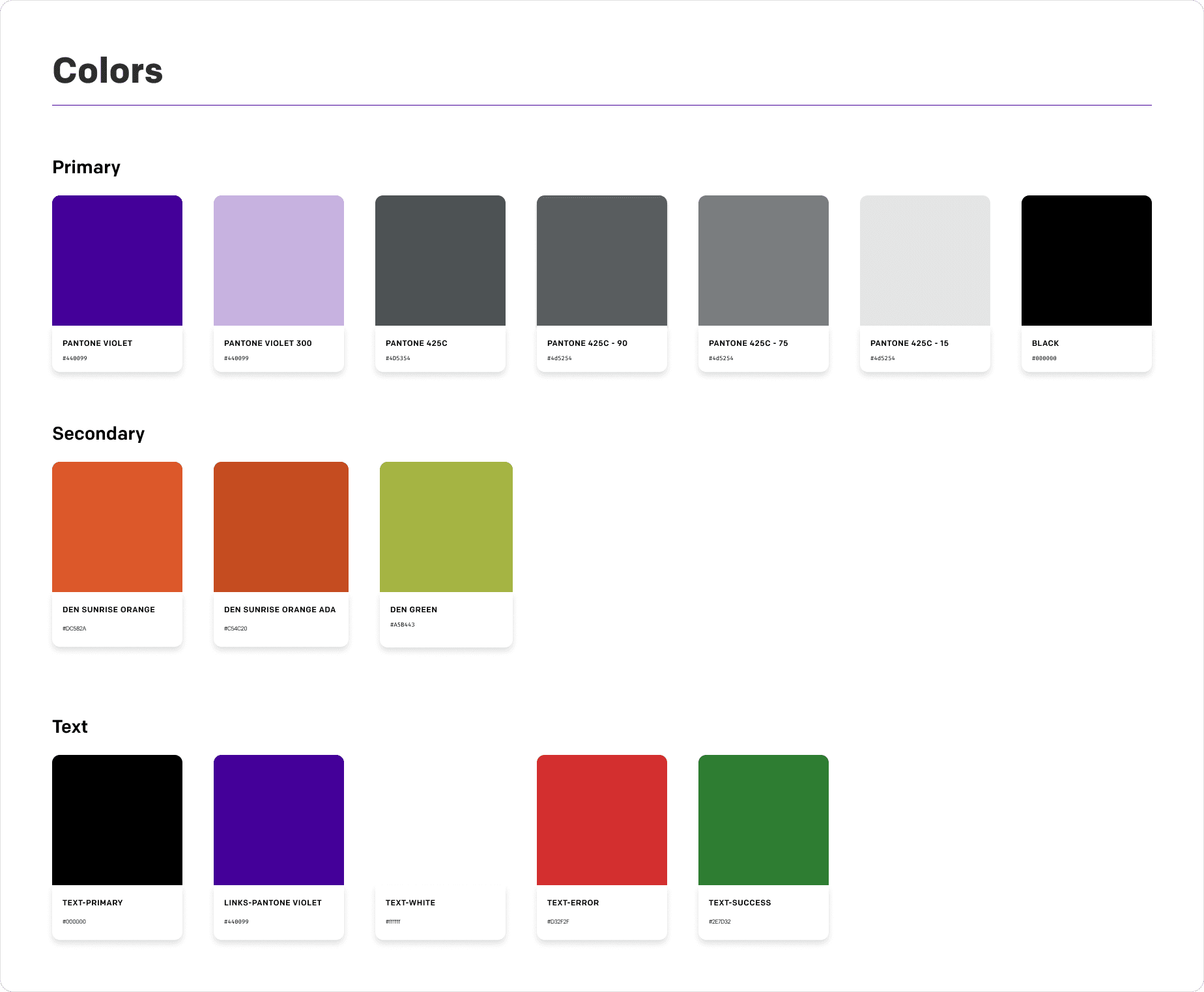
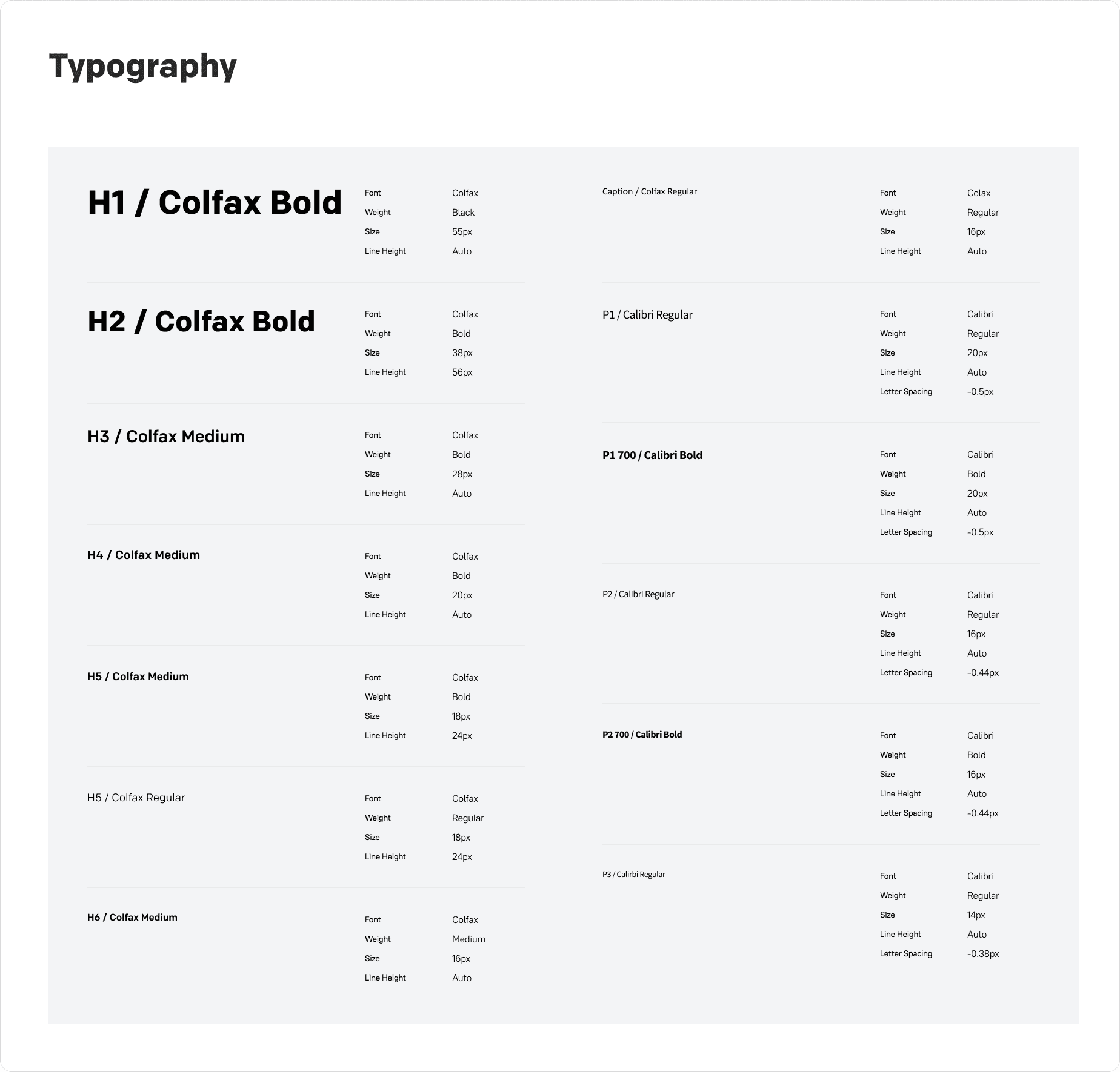
One of the biggest problems with the existing site was inconsistency: different pages used different colors, button styles, link treatments, and type scales. Before designing any page templates, I built a complete design system in Figma that every subsequent design decision would be drawn from. We wanted to build this design system so it could scale as the site grew, even past our time on the project.

Restructuring the IA
With the visual system defined, the core challenge became structural. The original IA had 9 top-level nav categories, many of them internal-facing (Employee Services, Financials, Careers) sitting alongside traveler needs like Flights and Parking. I used the analytics findings from research to rebuild the IA around what travelers actually came to the site for.

Flights moved to position 1
Analytics showed flight search was the single most-visited page. It became the first item in the nav, with a dropdown leading directly to the search interface.
"Dine, Shop & Relax" grouped by traveler mindset
Travelers did not think about these services as separate departments. Grouping them under one nav item reduced cognitive load and matched the F-shaped scanning pattern research showed.
Business content moved to the footer
"Employee Services," "Financials," and similar internal pages moved to a dedicated Company section and footer, so they no longer competed for traveler attention in the primary nav.
FINAL DESIGN
A homepage that put traveler's top tasks first.
scope.
The final homepage design brought every layer of the project together: the search-first interaction pattern from the moodboard exploration, the refreshed color and component system, and an IA-driven layout that surfaces the airport's most important content, flight search, security wait times, parking, and dining, above and just below the fold.
What made it work
Flight search above the fold on every device
Quick-link cards anchor every visitor's next step
Real photography connects digital to physical
OUTCOME
A system DEN's team could build on, not just inherit.
We packaged the full project which included moodboard rationale, design system documentation, the IA map, and annotated page templates into a handoff for DEN's internal team. The templatized approach meant new pages could be built by classifying content into an existing template, rather than starting from a blank canvas each time.


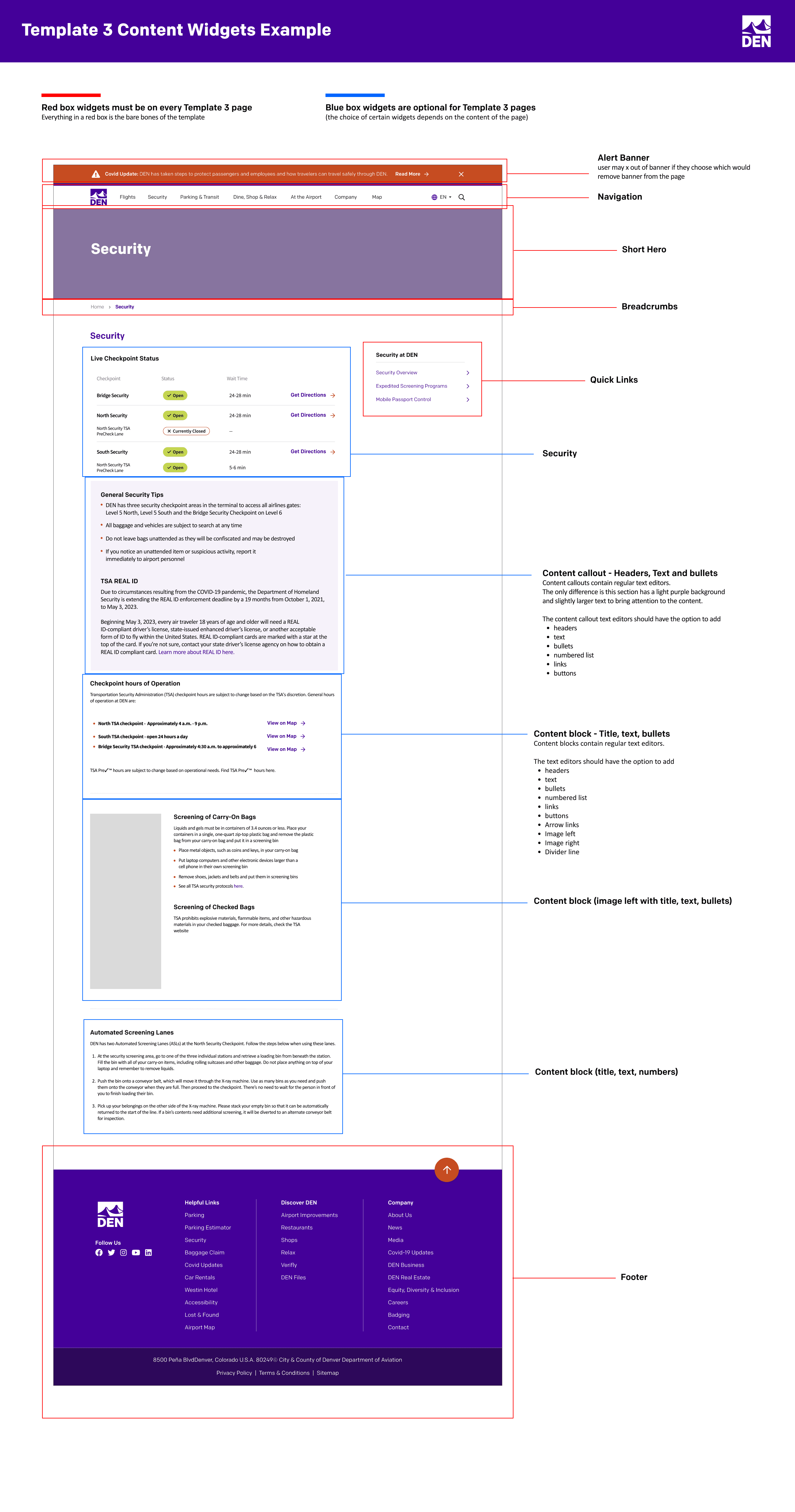


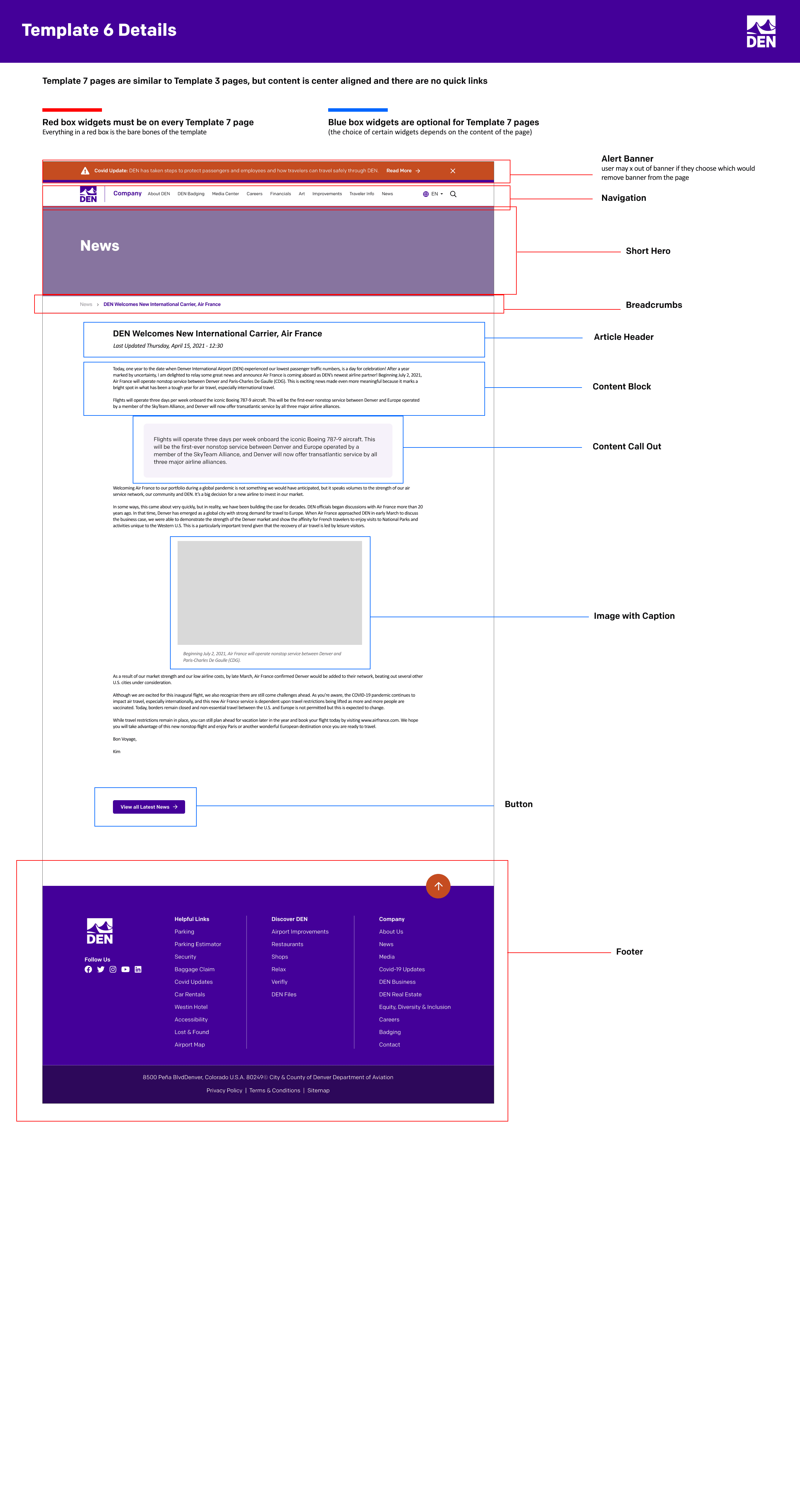
Templates handed off to DIA Internal team
SINCE LAUNCH
This project was handed off in 2021, and flydenver.com has continued to evolve since, but the templatized structure and visual design from this work shaped how the site was organized for years afterward.
REFLECTION
What I learned.
01
Moodboards earn alignment faster than wireframes alone.
Presenting three distinct visual personalities before any hi-fi work gave the stakeholder team something emotional to react to not just structural. The moodboard selection conversation was the most productive single meeting on the project, because everyone was reacting to something concrete and distinct rather than negotiating in the abstract.
02
Templates are a design decision, not a developer convenience.
I initially thought of templatizing the site as something we did for engineering, a way to make development faster. In practice, deciding on 6 templates upfront shaped the IA, the content strategy, and the design system itself. Every nav category had to map to a template before it was allowed into the structure. That constraint, applied early, is what made the site scalable rather than just better-looking.
03
Visual sophistication has to scale with what a site represents.
Denver International Airport serves 69 million passengers a year and operates at a scale most websites never have to. A simple, friendly aesthetic that might work fine for a small local business read as outdated on a site representing an institution of that size. The audit and competitive analysis confirmed it: the highest-scoring sites, Heathrow, Changi, were not just usable, they looked like the modern, well-resourced global operations they actually were. At that scale, visual polish is not decoration. It is a signal of credibility that travelers read instantly, often before they read a single word of content.