WEB DESIGN · SHUTTERFLY · SHIPPED 2019
Bringing Information and Inspiration to a Bride's Shopping Experience

OVERVIEW
What if a landing page could do the job of a weeding planner?
In 2019, The Wedding Shop team at Shutterfly was tasked with building a landing page for their most important customer: the bride. The goal wasn't just to sell products. It was to capture future intent by communicating Shutterfly's end-to-end solutions save the dates all the way through to thank you cards and become a one-stop shop for inspiration and information.
The challenge was that these two briefs (inform and inspire) were in tension. Too much editorial content crowds out the shopping experience. Too much product overwhelms a customer who doesn't know where to start. I worked alongside two designers, presenting through three rounds of stakeholder reviews to find a design that resolved that tension.
Solution
Informing and inspiring the bride as they shop
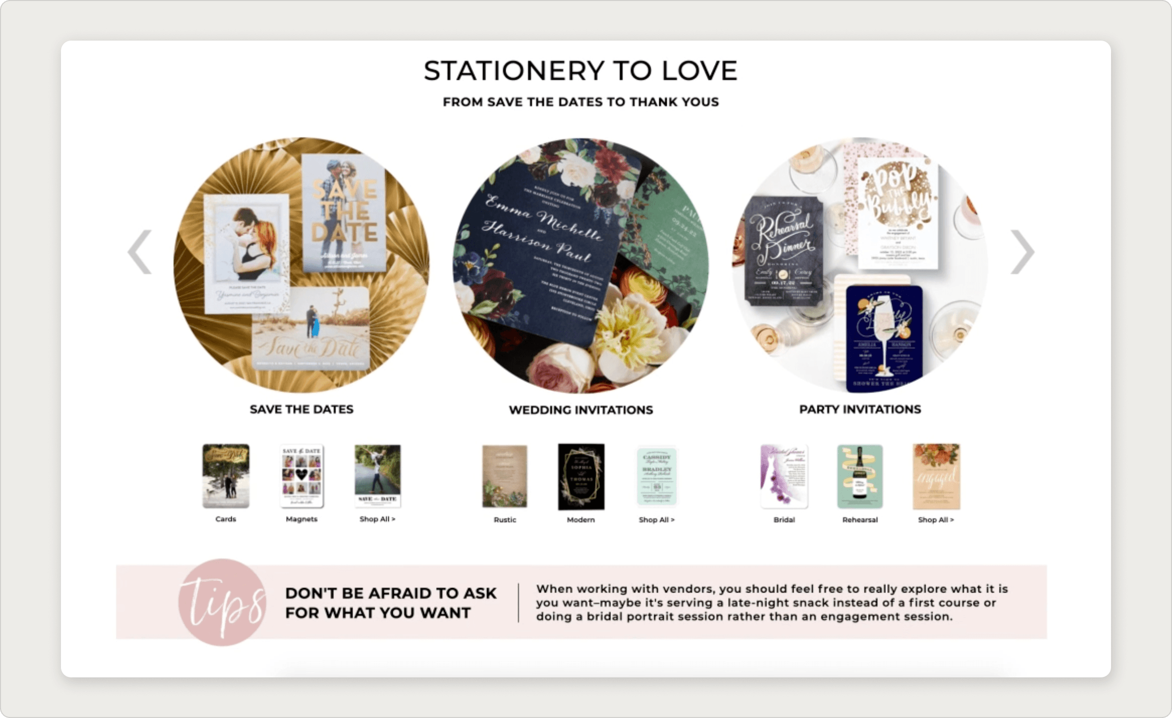
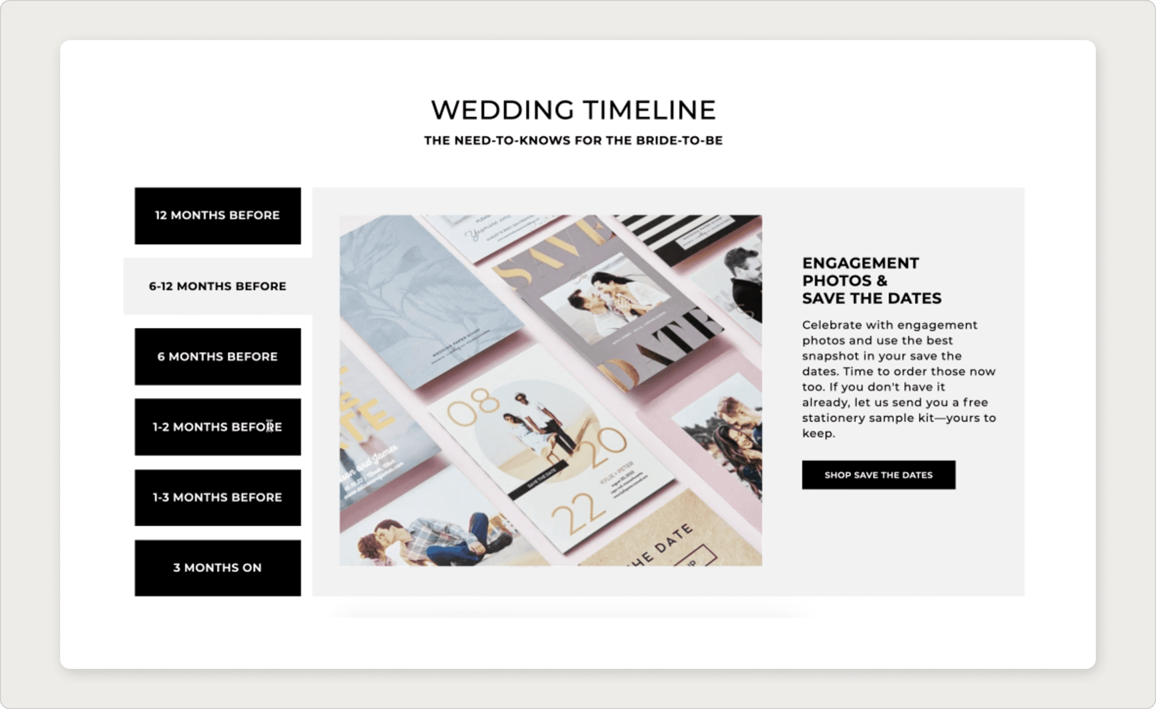
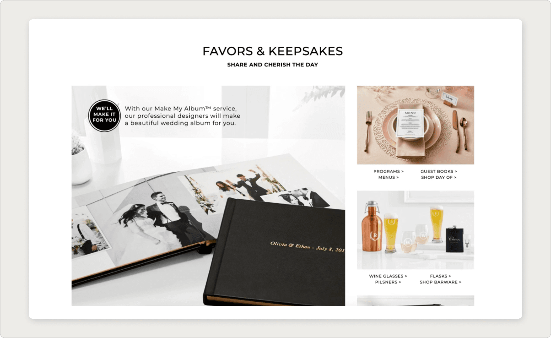
Sections of the redesigned wedding shop landing page.
CHALLENGE
End to End solutions that brides didn't know existed.
scope.
The Wedding Shop offered a full suite of wedding stationery products save the dates, invitations, programs, menus, and thank you cards. The business opportunity was clear: Shutterfly could serve a bride at every stage of her planning journey, not just the invitation order. But customers weren't experiencing it that way. They'd land on the page, find what they came for, and leave never knowing the rest of the range existed.
The brief had two distinct layers that had to coexist on a single page:
Show the full wedding journey, not just a product catalog
Brides needed to understand that Shutterfly's products mapped to specific moments in wedding planning. A product grid alone couldn't tell that story.
Make it shoppable, not just educational
Informational content can kill conversion if it replaces product visibility instead of supporting it. Every editorial decision had to earn its space by also driving purchase intent.
Design for a customer who doesn't know where to start
Research showed that "knowing where to start" was one of brides' biggest planning challenges. The page had to reduce that anxiety, not add to it.
HMW
How might we show brides that Shutterfly has budget-friendly solutions for every stage of their wedding, without burying the product under content?
DISCOVERY
Learning how modern brides plan.
scope.
Shutterfly had a partnership with The Knot and WeddingWire, which gave us access to their annual research on wedding planning behavior. The 2019 WeddingWire Newlywed Report became a primary source. We paired it with Shutterfly's own customer data on The Wedding Shop audience.
Who is the TWS customer?
01
Young, budget-conscious, high aesthetic standards
The average TWS bride is 18-34, with a household income of around $48k. She wants her wedding to look beautiful but is acutely aware of cost. Budget-friendly doesn't mean cheap it means she needs to understand the value of what she's buying.
02
Planning starts before the ring
Over 85% of couples start discussing wedding preferences before they're even engaged. The bride who lands on the Wedding Shop page may already have a vision. The opportunity is to connect Shutterfly's products to the vision she already has.
03
Planners are less common brides are going it alone
Professional wedding planners are increasingly rare as weddings get smaller and budgets tighter. That means the bride is often navigating stationery logistics, timeline questions, and product decisions without expert help. Shutterfly had a real opportunity to fill that gap.
04
"Knowing where to start" is the biggest challenge
WeddingWire data showed that despite brides being highly proactive in planning, "knowing where to start" remained one of their top pain points alongside "planning within budget." The landing page needed to give brides a starting point, not another list of products to scroll through
"Despite being so proactive, couples still say one of their biggest challenges during planning is "knowing where to start" in addition to "planning within budget."
WeddingWire 2019 Newlywed Report
KEY INSIGHT
Brides don't need more product before they need more context. The landing page could become a planning resource that happened to sell products, not a product page that happened to have content.
DESIGN PROCESS
Four solutions, one brief.
scope.
My team and I worked through multiple design directions, each trying to resolve the same tension: informing brides without interrupting their shopping flow. We asked ourselves three framing questions:
O1
How can we inform brides of important dates in the planning process?
Stationery has unwritten rules about timing that most brides don't know. A timeline could make Shutterfly the expert resource, not just the vendor.
O2
How can we clarify the stationery options available?
Most brides don't know the difference between a suite, an invitation, and a day-of collection. Product education in context could both inform and upsell.
O2
How can we inspire brides with end-to-end product solutions?
Beautiful photography showing Shutterfly products "in the wild" at real weddings connects product to aspiration in a way a grid can't.
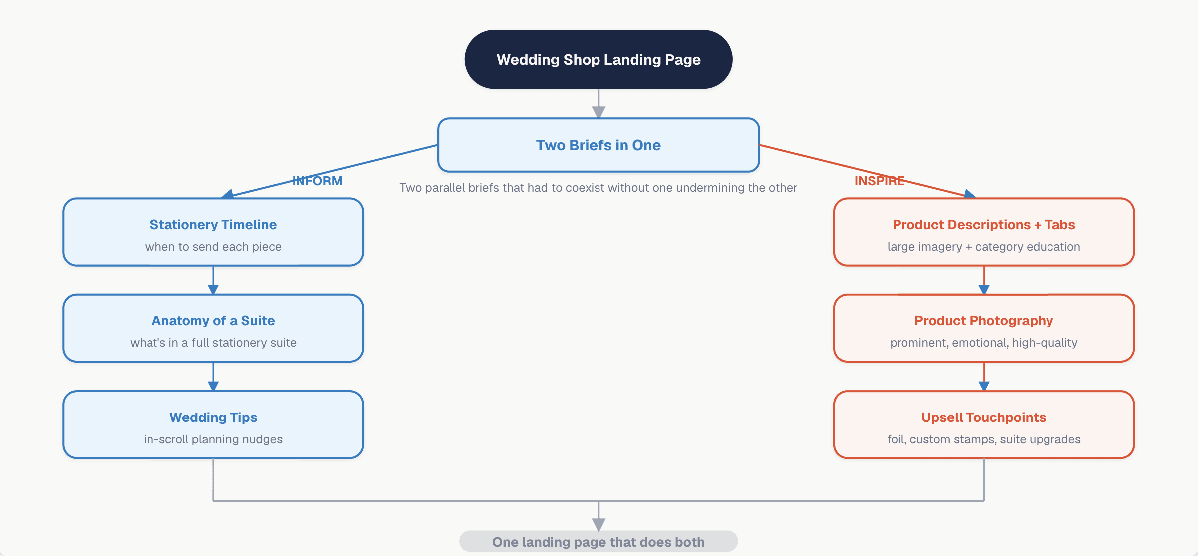
Content Strategy Map Inform vs Inspire
The dual brief mapped as a content hierarchy. Each design solution had to serve both a utilitarian (inform) and emotional (inspire) function simultaneously.
Concept 1: Product descriptions with tabs
A tabbed section where each category of wedding stationery got a dedicated panel: a large hero image on the left and a description explaining what that piece was, when to use it, and why it mattered. The goal was to make the product grid feel guided rather than overwhelming.
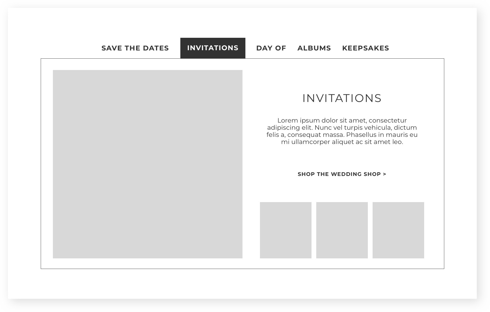
Product descriptions with tabs
Concept 2: Stationery timeline
One of brides' most common stationery questions is simply: when do I need to send what? There are unwritten rules: save the dates go out 6-8 months in advance, invitations 6-8 weeks that experienced planners know but first-time brides often don't. A visual timeline connected each product to its moment in the planning calendar.
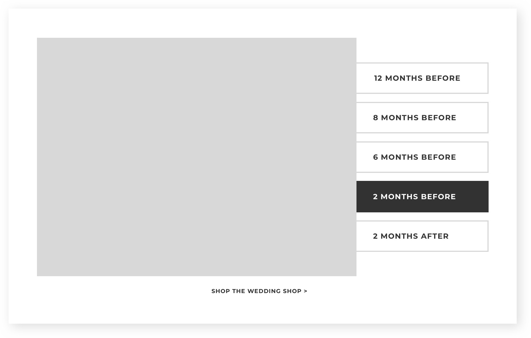
Wedding stationery timeline
Concept 3: Anatomy of a suite
Most brides don't know that a stationery suite is a coordinated collection: invitation, envelope, inner envelope, RSVP card, details card, and that each piece is an opportunity to add custom touches like foil or custom stamps. A visual breakdown of a suite served both as education and as a natural upsell touchpoint.
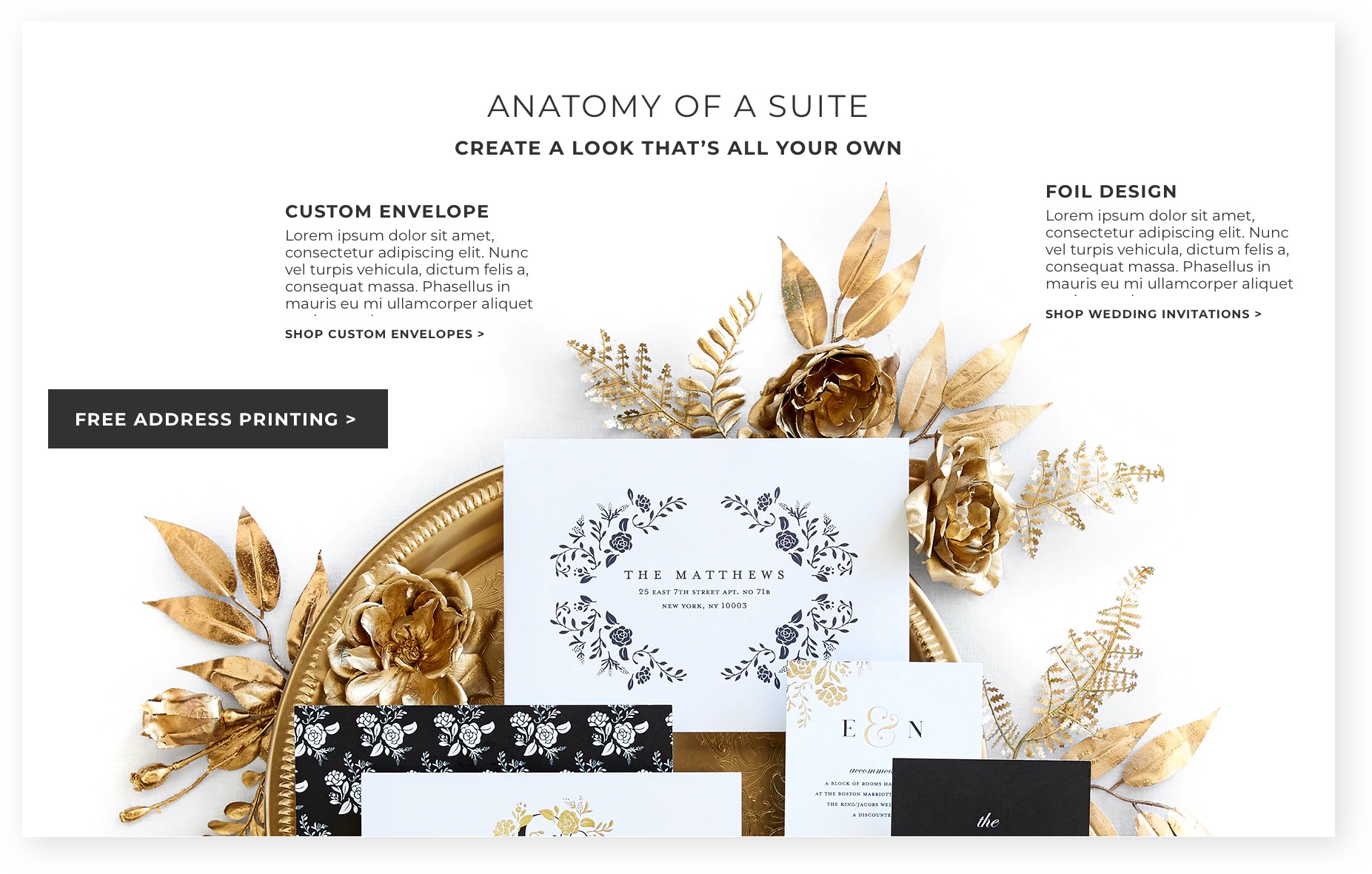
Anatomy of a suite
Concept 4: Wedding tips
Small strips of contextual advice interspersed throughout the page gave brides useful information without taking up the real estate needed for shoppable content. Tips could appear between product sections, feeling more like a friendly nudge than a content block.
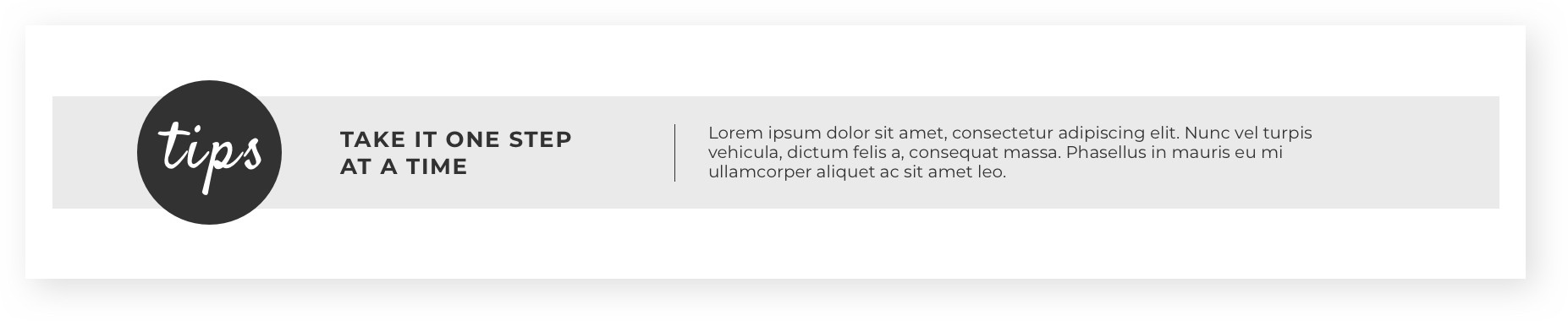
In-scroll wedding tips
FINAL DESIGN
A landing page that informs and inspires in the same scroll.
scope.
The final Wedding Shop landing page brought together the stationery timeline, anatomy of a suite, and in-scroll tips as the core informational layer, with large emotional product photography doing the work of inspiration throughout. The design solved for both briefs without either one undermining the other.
What made it work
Photography did the heavy lifting on inspiration
Beautiful Shutterfly product photography was kept prominent throughout. The imagery let brides see how products would look at a real wedding, connecting aspiration to purchase in a way no product description could.
The timeline made Shutterfly feel like a partner, not a vendor
By giving brides a planning timeline, something genuinely useful beyond the transaction, the page positioned Shutterfly as a resource for the whole wedding journey, not just an invitation order.
Tips and suite education created natural upsell moments
Brides who understood their stationery options were more likely to build a suite and add upgrades. Education and commerce reinforced each other rather than competing for attention.
Final feature flow inside the Healthfirst mobile app.
The final design shipped to shutterfly.com/weddingshop after three rounds of stakeholder review with the creative director, art director, and marketing team.
REFLECTION
What I learned.
01
Informing the customer is a form of selling.
The most effective design decision on this project was treating information as a purchase driver, not a distraction from it. A bride who understood the stationery timeline, suite structure, and product options was a more confident buyer. Educational content didn't compete with conversion it enabled it.
02
Presenting to non-designers is a design skill.
Three rounds of stakeholder reviews with marketers, a creative director, and an art director taught me how to frame design decisions in terms of business outcomes. The question "why does this layout work?" has a different answer depending on whether you're talking to a designer or a VP of Marketing. Learning to translate between those two audiences made every subsequent project easier.
03
Two briefs in one page requires a clear hierarchy.
The hardest design problem on this project wasn't any individual layout it was deciding which brief (inform or inspire) took priority in any given scroll position. The answer was that photography always anchored the page emotionally, while content modules provided context at specific moments. Neither could dominate the entire page; they had to take turns.