WEB APP · GRANULAR INSIGHTS · SHIPPED 2025
Map as Navigation: Giving Sales Reps a Visual Way to see Their Fields

SNAPSHOT
What if the fastest way to find a field was to look at one?
Granular Insights is Corteva's tool for Pioneer seed sales reps managing hundreds of grower fields across dozens of farm operations. The product had everything reps needed: except the one thing they actually carry in their head: a map of where their fields are.
As Senior Product Designer, I led the concept and research that brought map-based navigation to the product. The feature shipped to production in 2025.
Solution
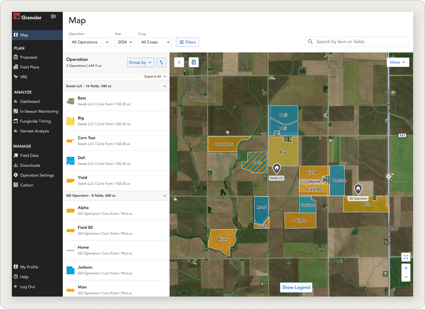
A dedicated map view that replaces the data table as the primary way to navigate: turning a 600-acre operation into something a rep can see in two seconds.
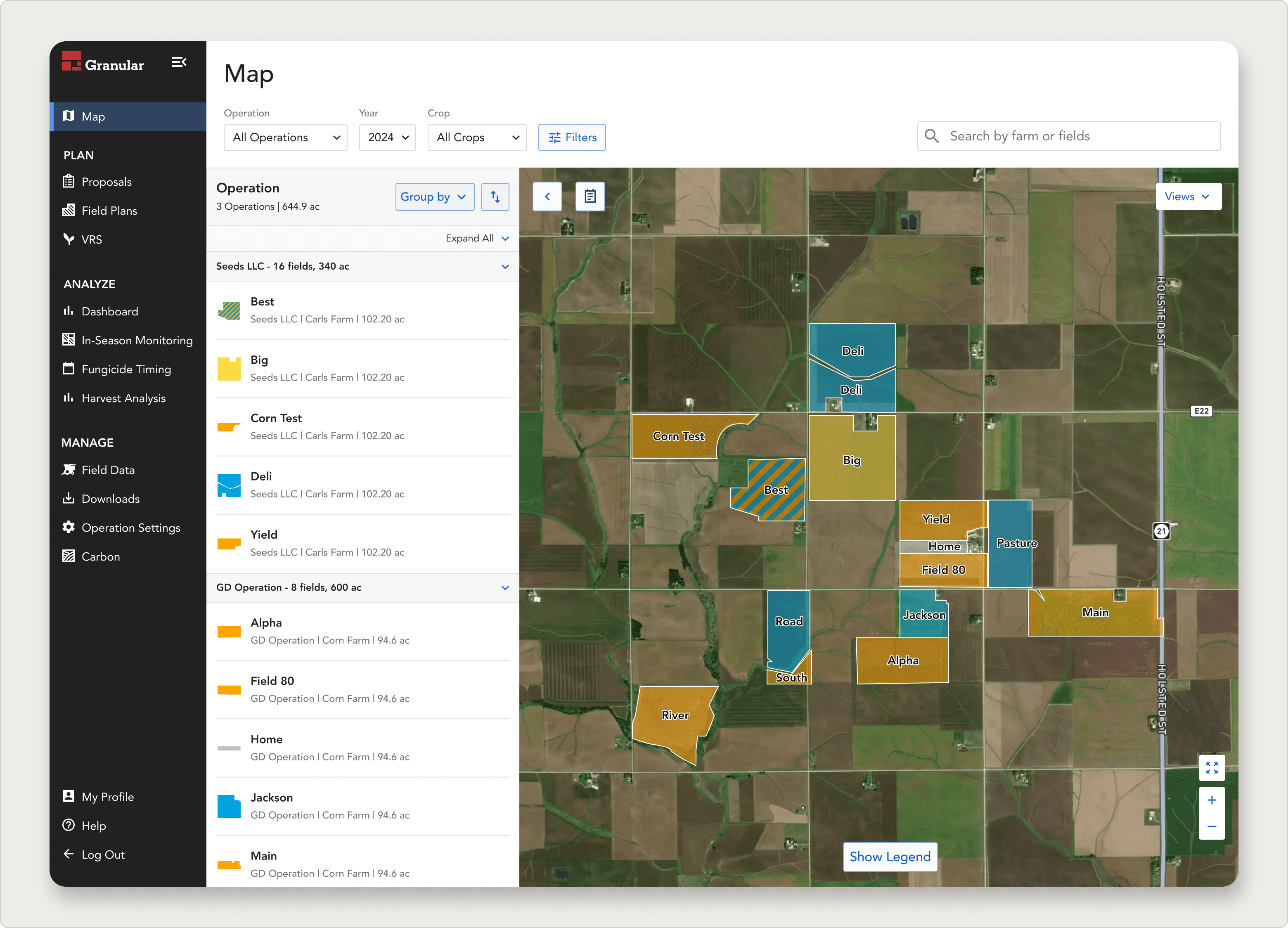
Cross-operational map view at default zoom
All operations and fields visible at once across both Seeds LLC and GD Operation — matching the rep's geographic mental model of their territory.
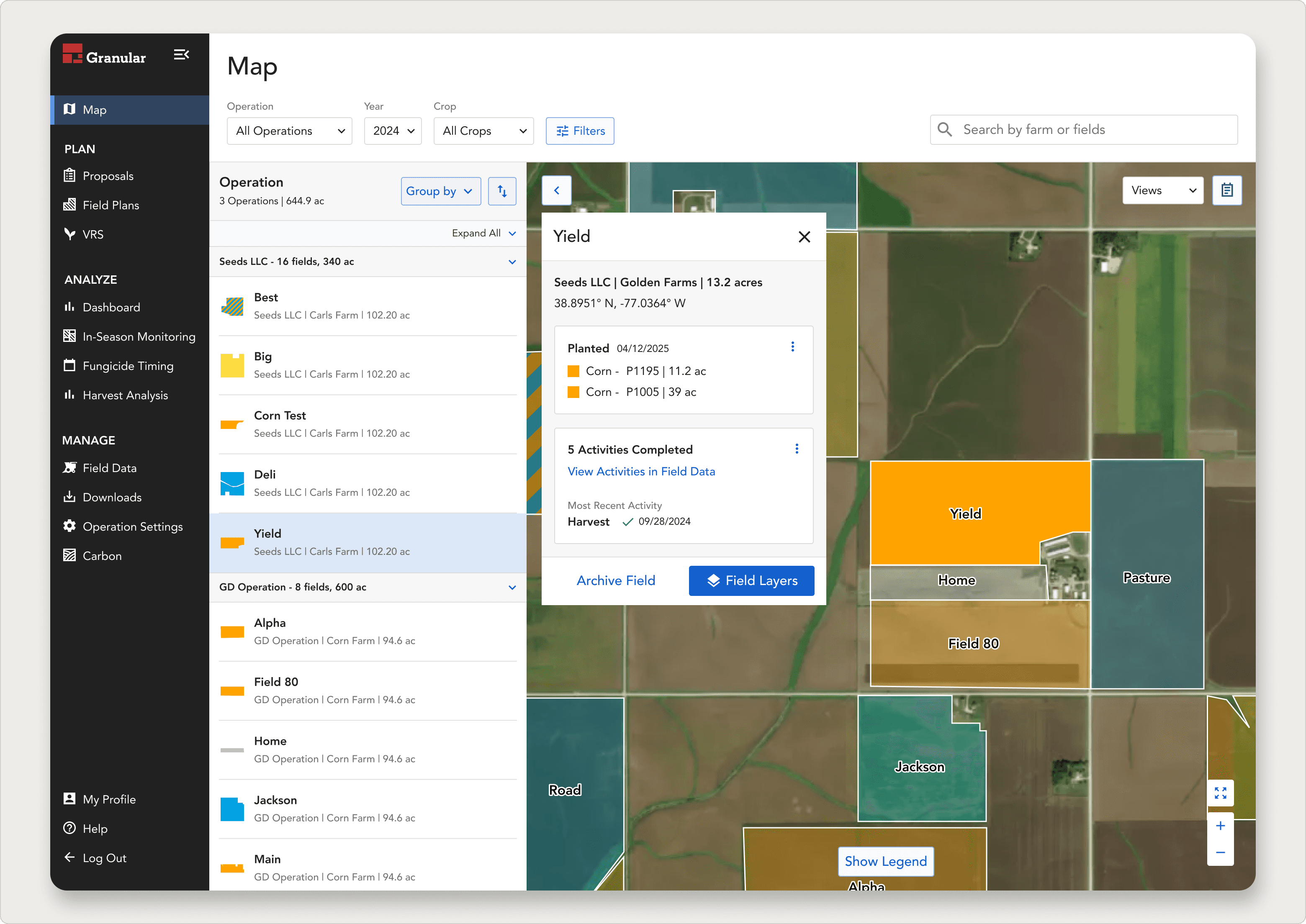
Field Details Panel triggered from a tapped field
Field cards surface crop type, acreage, and recent activity on tap — without leaving the map. Filters by operation, year, and crop narrow the view to what's relevant right now.
6/6
interviewed reps rated this feature useful in their daily work
8/10
average usefulness score — no onboarding needed
Live
Shipped to production in Granular Insights web app
THE QUESTION
Should we even build this?
Coming in, the team didn't agree on whether a map was worth building. Some voices argued reps had everything they needed in the data table. We held discovery sessions with some select groups and heard the opposite from them. Without data, the conversation kept stalling on opinion. I was asked to settle the question the right way: build a concept, put it in front of real reps, and let research decide.
Pre-map navigation: a data table of operations and fields.
Reps had to scroll, sort, and cross-reference to find what they needed.
To answer the question, we had to understand how reps were actually working today, not just what they said they wanted. Using pre-defined user personas and feedback from the initial discovery sessions, I mapped the current-state experience across five phases of a rep's daily workflow.

Current-state Sales Rep Journey Map · September 2024 · FigJam
MAP BASED OPPORTUNITIES
Two patterns emerged consistently: reps navigate spatially but the tool forced alphabetical navigation, and cross-operation visibility required leaving the product entirely. Those two findings shaped the concept.
THE HYPOTHESIS
Designing to test, not to ship.
I designed a Figma prototype of a map-first navigation experience inside Granular Insights. The prototype wasn't the final design. It was meant to be interrogable: clear enough for reps to react to, flexible enough that any part could be cut. The concept covered an operations and fields panel, satellite map with field boundaries, field cards on tap, and filters.
Research Objectives
We recruited six participants, four sales reps (Tony, Megan, Kyle, Tanner) and two territory managers (Mitch, Matt), to stress-test one hypothesis:
that geography-first navigation would be more natural than operation-first navigation.
Secondary questions: what's the minimum viable feature set, and what does mobile need to look like?
THE PROTOTYPE
Using AI to test interaction
BUILT WITH AI
I used AI to build a fully interactive coded prototype in a day.
Rather than asking engineering to build a throwaway prototype, or accepting the limitations of Figma, I used Lovable: an AI-powered app builder: to generate a working React prototype with a real Mapbox integration. I described the feature in plain language, iterated on the interactions through conversation, and had a testable build running the same day I started.
This wasn't about cutting corners on design craft: it was about matching the fidelity of the test to the fidelity of the question. The prototype let reps do the thing we needed to observe: actually navigate their territory on a map, tap into a field, filter by crop, and tell us whether it matched how they work.
Video of the interactive prototype built with ai, allowing users to pan and zoom on an actually mapbox map let user feel how the interactions would happen when fully developed.
What the interactive prototype unlocked
Reps could actually explore, not just observe
Instead of watching a researcher click through frames, reps drove the session themselves, panning to their actual territory, tapping the fields they'd stand in front of the next morning. That self-directed navigation surfaced behavior and preference that a guided walkthrough would have masked.
TAKEAWAY oN AI tOOLS IN THE DESIGN PROCESS
AI didn't replace the design work. The thinking, the research strategy was all still designer-led. What it replaced was the fidelity ceiling. AI let me match the prototype to the question, not the other way around.
FROM THE FIELD
The findings
Feedback Synthesized then Shared with Dovetail
Insights were collected in Dovetail and shared throughout the team. The report clipped real parts of interviews with users to highlight the importance of their quotes.

6 user interviews synthesized into theme clusters · October 2024 · FigJam
From feedback, I mapped the current-state experience across five phases of a rep's weekly territory work — from planning the route to following up after scouting. The map surfaced two consistent findings: reps navigate spatially but the tool forced alphabetical navigation, and cross-operation visibility required leaving the product entirely (opening Google Maps in a second tab). These two pain points became the brief for the map feature.
Insights that Emerged from Feedback
01
Crop scouting is the use case the map unlocks
Crop scouting — driving out to check fields in person — is one of the reasons growers choose Pioneer seeds. Reps saw the map as the tool that would make scouting more efficient: filter by product, plan a route, scout the fields that matter, and skip the rest.
02
Low learning curve, high satisfaction
Reps rated the feature 8 out of 10 for usefulness in their day-to-day. Nobody needed onboarding to use it. From an adoption standpoint, that's the cheapest possible product.
03
Reps want to control what they see — map views matter as much as the map itself
Hail storms and disease outbreaks don't follow operation boundaries. A rep needs to see all their fields in an affected area at once, then act. The table view forced them to check operation by operation — the map collapses that into one screen.
04
This belongs on mobile
Reps are in the field. They need this on their phone, with their location, with nearby fields visible in real time. Web is the start — mobile is where the value compounds.
Insight 03 in depth: Letting Reps Customize their View
Reps weren't just asking for a map, they were asking for a map that could answer different questions on different days. The same territory looks completely different when you're planning a scouting route vs. responding to a hailstorm vs. reviewing what's been planted this season. A single static view can't serve all of those contexts. Reps needed to toggle layers.
"If I can see all this information on one map, I'm planning my whole week in five minutes."
- Tony, Sales Rep
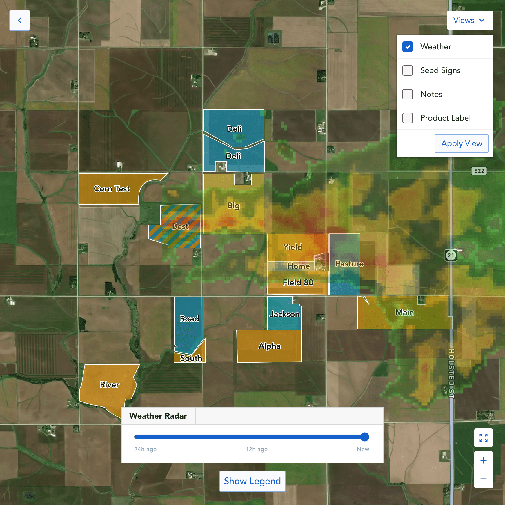
Weather Radar
Immediately see which fields sit inside a hail storm letting users know which fields were hit.
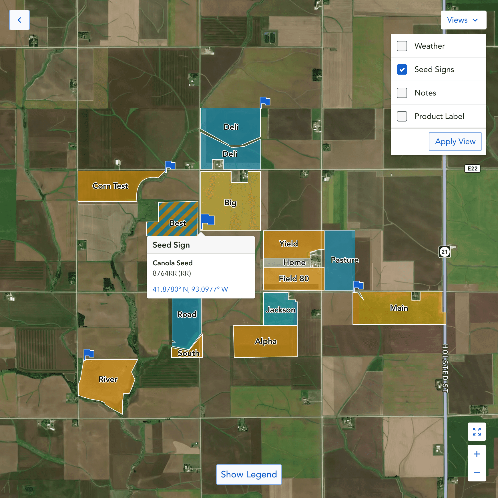
Seed Sign Placement
A big administrative pain was remembering where seed signs where placed.
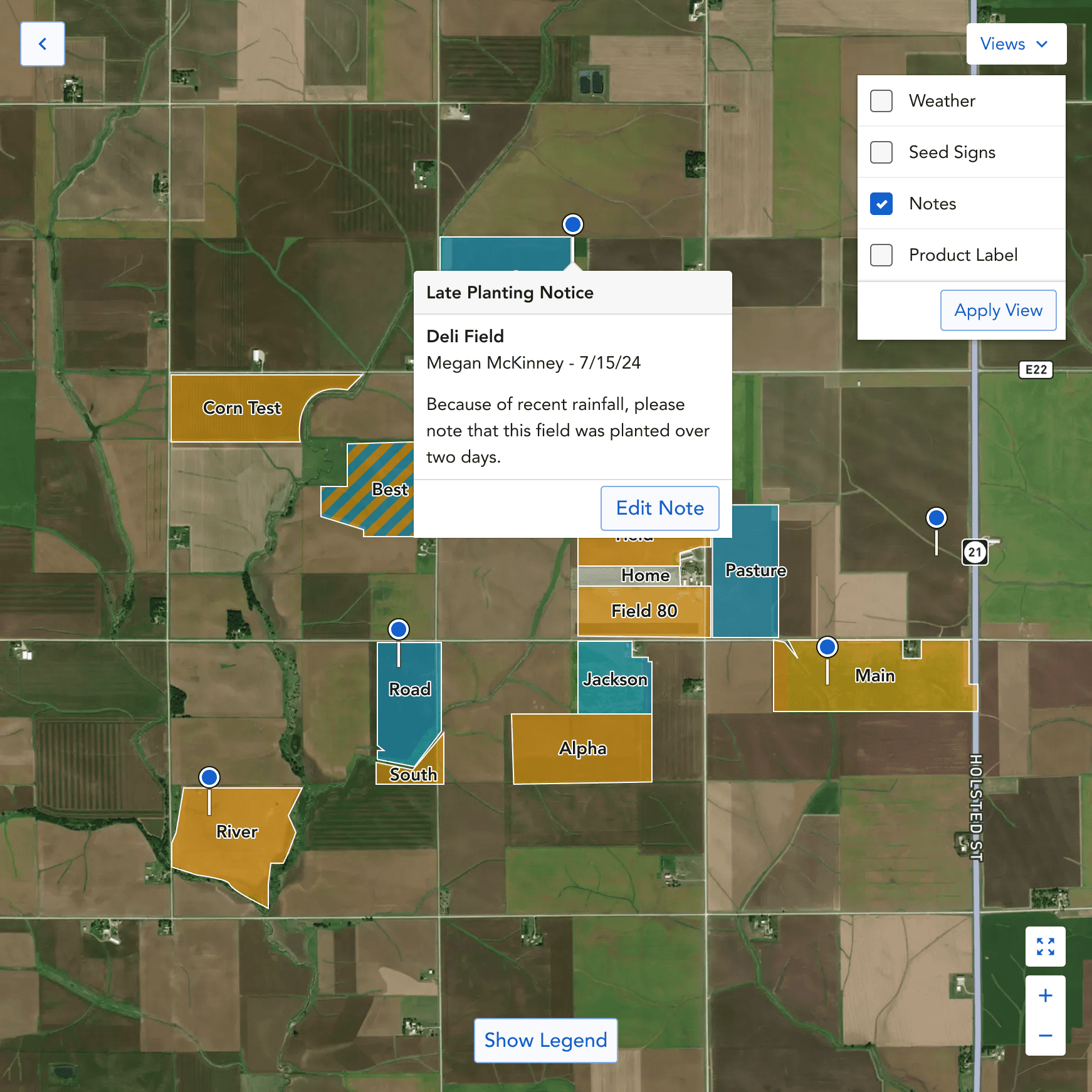
Notes
Notes add an easy way to remember information at a physical location.
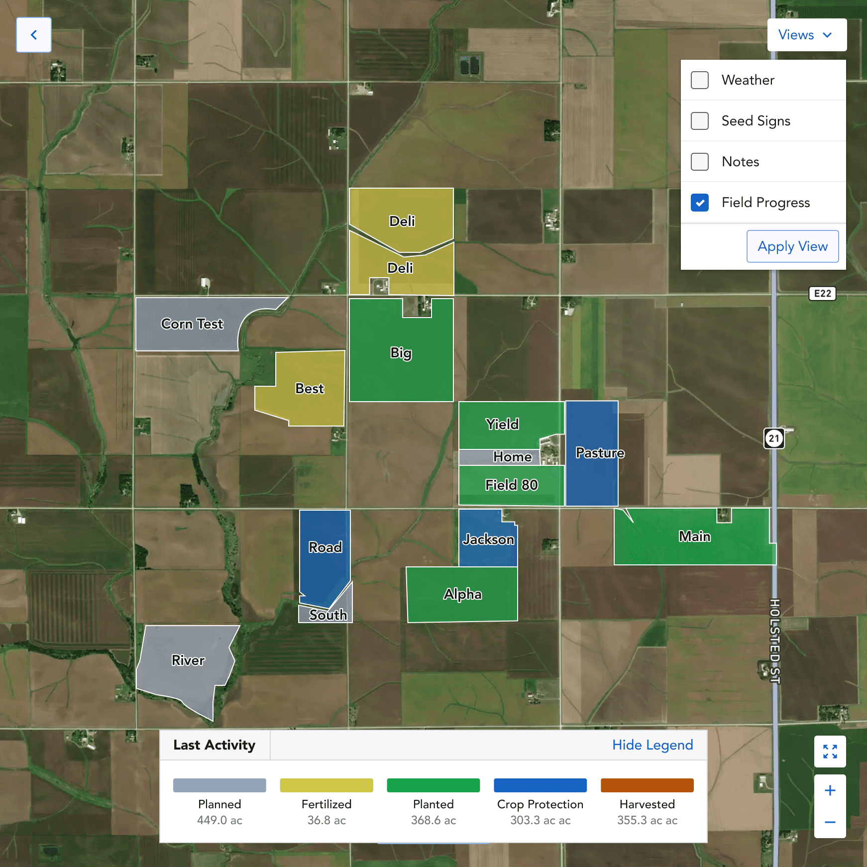
Field Progress
Color-code every field by last activity planned, planted, harvested, etc. to give reps a progress overview.
THE ITERATION
The mental model already is a map.
Making the Case to Change Direction
From our findings we saw that our hypothesis of how users want to drill down to their field was all wrong. Recommending we abandon the original architecture was a significant call: it had engineering implications and meant going back to the PM with a scope change mid-project. I brought the decision to the team with session clips from the research recordings: multiple users hitting the same wall, in their own words. When the evidence is that consistent, it's not a design opinion anymore. It's a user demand. The PM and engineering lead aligned quickly once they saw the clips. The cross-operational pivot moved forward.

Mental Model illustrated to stakeholders · November 2024 · FigJam
"Why am I picking one operation? I just want to see them all on the map."
- Tanner, Sales Rep
Concept v1 — Operations First
Pick an operation, then see fields.
Mapped directly to Granular's data model — but asked reps to choose a context before seeing geography. Created friction that didn't exist in real life.
Concept v2 — Geography First ✦ Shipped
See your territory. Drill into fields.
All operations and fields visible at once. The operations panel becomes a filter, not a gatekeeper. Detail surfaces as the rep zooms — matching the way they actually think.
SECTION
Defining
scope.
With research in hand, the team made some key MVP decisions.
Build it as a dedicated section, not a homepage
Reps needed to find it easily, but a daily/sales dashboard was a better candidate for the app's landing experience.
Keep it view-only for field data
Reps preferred read-and-explore behavior. Adding analytics or edit actions could come later, based on usage data.
Show operations and fields in one cross-operational view
The finding from the mental-model research. The map is the surface. The operations list is a filter, not a gatekeeper.
Mobile is needed
Mobile location-aware behavior was the strongest forward-looking opportunity
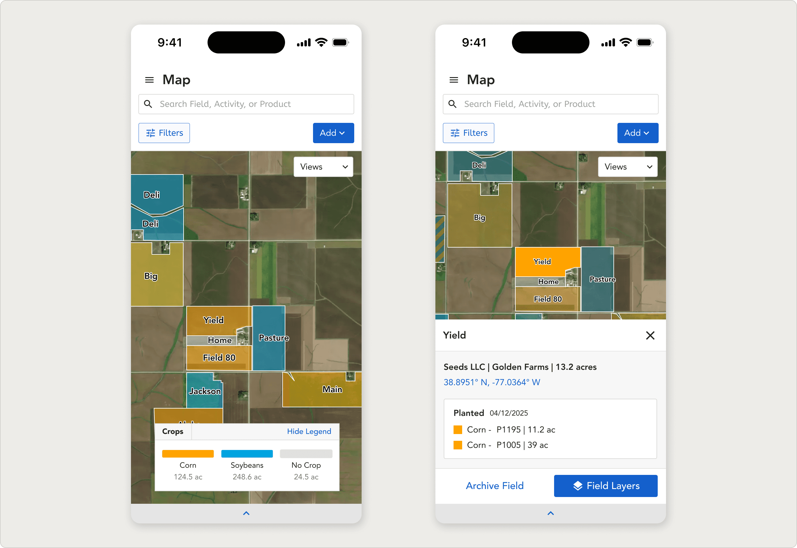
Mobile concept: the same map, with location awareness. The strongest forward-looking opportunity from research.


Final design shown zoomed out and with a field highlighted
KEY INSIGHT
The map was a quick win that resolved an internal debate. Territory managers said it directly: a tool reps had been asking for, finally delivered, would help convert skeptics to Granular.
REFLECTION
What I learned.
01
Research backed concepts can settle debates that opinions can't.
The internal debate about whether to build a map feature had been running on opinion for months. A single prototype session with six reps produced clearer direction than a dozen stakeholder meetings had. When research is in the room, the question shifts from "do we think users want this?" to "here's what users actually did.
02
Designing for sales reps means designing for people you can't watch work.
These reps are in trucks, in cornfields, in growers' kitchens. Their work doesn't happen at a screen, so observation-style research is harder. The map only resonated because we got crop scouting, seed sign placement, and weather response into the conversation early — and let reps tell us how a screen could fit into their actual day.
03
The product has to match the mental model, not the data model.
The biggest design moment on this project was the cross-operational pivot. Granular's data is organized by operation — so the original concept was too. But sales reps don't think in operations. They think in geography. A map only feels like a map when it shows you everything at once, the way the territory actually looks from the driver's seat. When the data structure and the user's mental model disagree, design to the mental model.